The Power of the Email Builder Inline Editor
Embedded within our Templates and Campaigns platform, the Email Builder Inline Editor is a powerful tool that revolutionizes the creation and customization of emails with remarkable efficiency and simplicity. It provides a user-friendly interface that eliminates the complexities of email design and formatting.
The Email Builder Inline Editor employs the "What You See Is What You Get" (WYSIWYG) editing principle. Imagine you're drafting an email and decide to make changes such as bolding a sentence, inserting an image, or modifying the color of a heading. With this editor, as you make these adjustments, they are immediately reflected, giving you a real-time preview of how the final email will appear. This seamless editing experience enables you to create better emails efficiently.
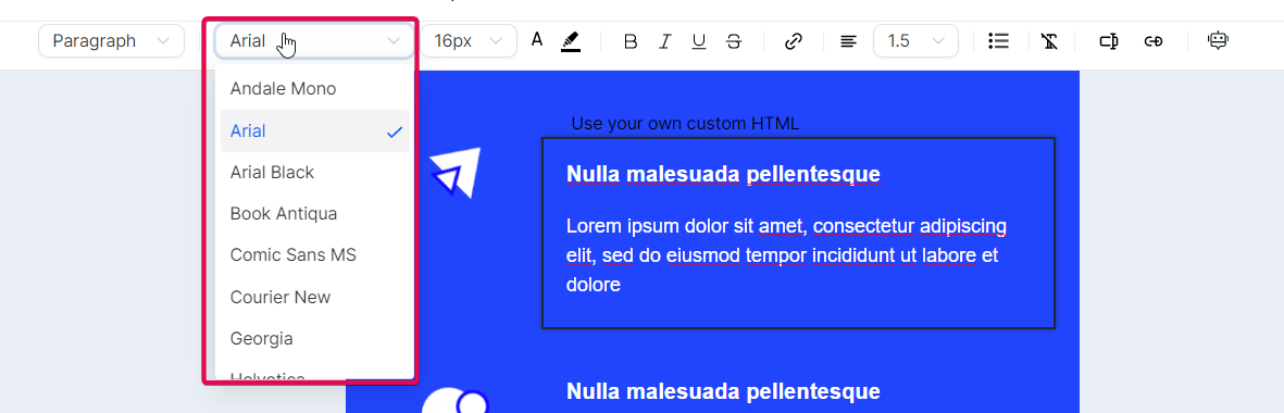
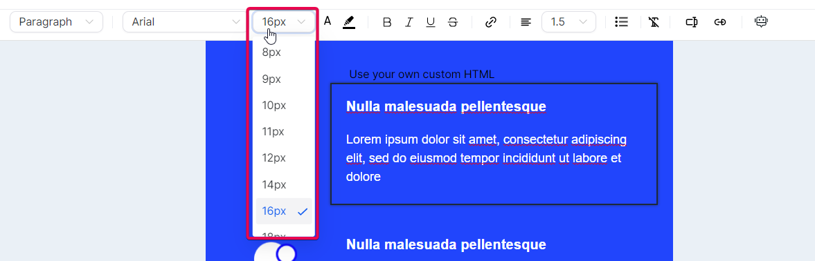
This robust tool offers a range of customization features, empowering you to style your email content easily. You can utilize multiple heading and paragraph formats, choose from a selection of supported fonts, adjust text sizes from 8px to 96px, and precisely select text colors using hex codes. The editor also enables text formatting options such as bold, italic, underline, and strikethrough and the ability to add hyperlinks for redirection.
Additionally, the inline editor supports custom values, allowing you greater control over your email content. It even offers AI-assisted content generation, which can assist you in creating engaging email content more efficiently.
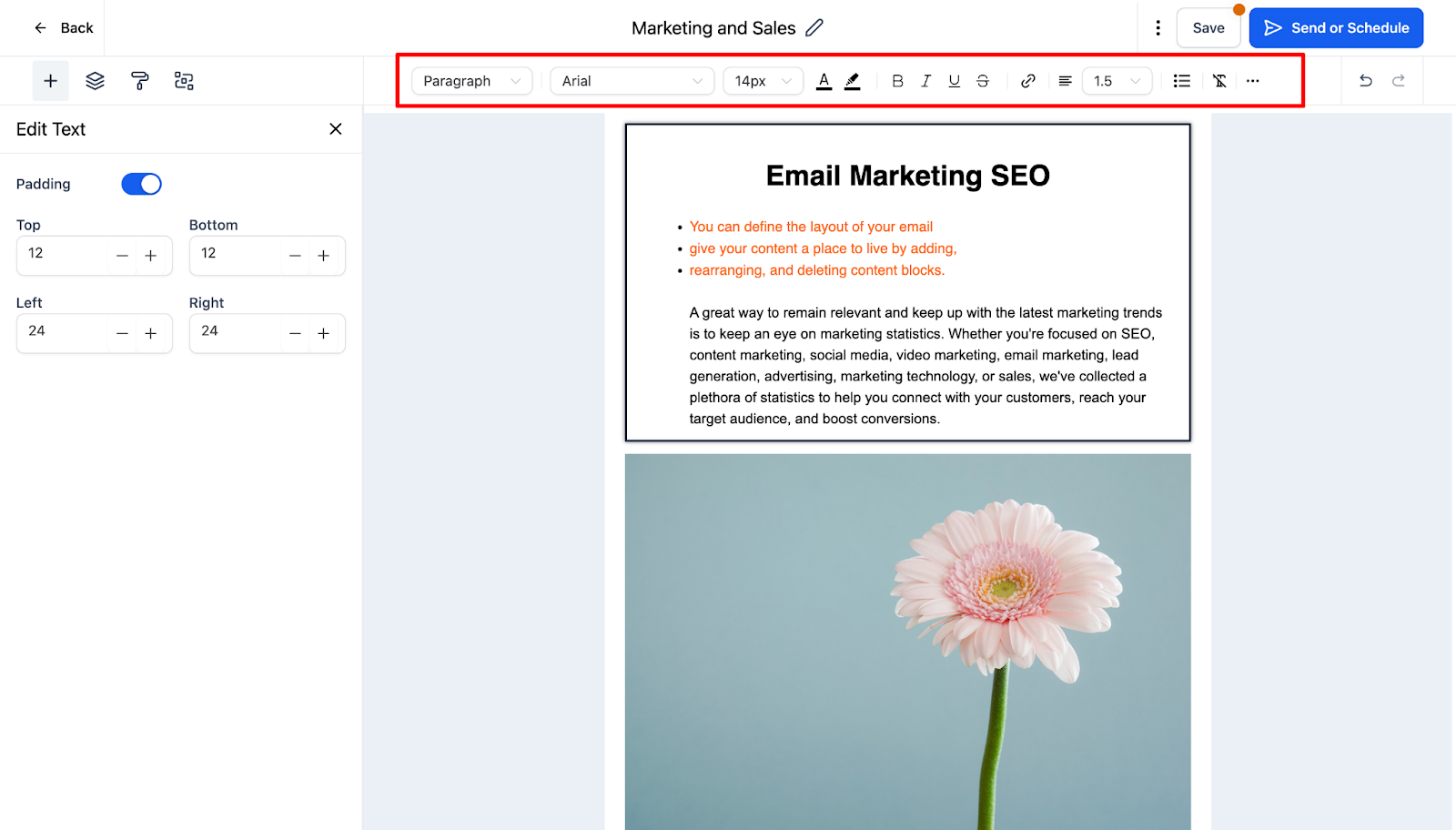
Important Notice:
We have made a default padding update to ensure a consistent and uniform structure in your emails. You can now manage the spacing around your content. Please note that the default padding settings are as follows:
- Top Padding: 12
- Bottom Padding: 12
- Left Padding: 24
- Right Padding: 24
This feature grants you improved control over your emails' layout and visual presentation.
Practical Usage Cases for the Email Builder Inline Editor:
- Promotional Email Campaign: Use vibrant colors, catchy fonts, and high-quality images. Opt for a single-column layout for mobile readability and place the CTA button prominently with bold colors.
- Seasonal Newsletter: Optimize information architecture with a multi-section layout. Include product categories, optimized images, and brief descriptions. Choose complementary background colors and easy-to-read fonts.
- Re-engagement Campaign: Maximize personalization with a single-column layout, warm colors, and inviting fonts. Use dynamic content settings to personalize the message based on the recipient's previous interactions.
- Abandoned Cart Email: Utilize a two-column layout, showcasing the abandoned products on one side and reminders with special offers on the other. Use dynamic content to automatically insert images and details of the abandoned items.
- Event Invitation: Keep the email clean and straightforward with a single-column layout, minimalist design, and a clear CTA. Consider adding a countdown timer component for a sense of urgency.
- Educational Email Series: Depending on the complexity, choose a single or multi-section layout with a mix of text, images, and videos. Highlight links and provide key takeaways using lists or bullet points.
- Customer Appreciation Email: Personalize the email with dynamic content, including the customer's name and specific details about their interactions. Use a single-column layout and soothing colors to create a warm and appreciative tone.
- Post-Purchase Follow-Up Email: Use a simple, single-column layout with colors that match your brand. Keep the message clear and concise, and utilize dynamic content to provide specific details about the customer's order.
- Onboarding Sequence: Create a series of emails with step-by-step instructions using a single-column layout, clear text, images, and videos. Personalize the emails with dynamic content using the user's name.
- Product Launch: Create an exciting email with a single-column layout, vibrant colors, large fonts for important details, and high-quality product images. Incorporate a countdown timer component for urgency.
- Webinar Announcement: Design a clean and straightforward email with a single-column layout, prominent headline, clear CTA button, and dynamic content tailored to the recipient's interests.
- Weekly Digest: Opt for a multi-section layout, summarizing different content categories with CTAs to "Read More" or "Watch Now."
- Survey Invitation: Use a single-column layout, clearly explaining the purpose of the survey with a prominent CTA button to start.
- Donation Request: Create a single-column layout with heartfelt content, images representing the cause, and a bold CTA to donate. Personalize the message using dynamic content.
- Testimonial Request: Craft a simple, personal, single-column email with a direct CTA to encourage a positive response.
- Membership Renewal Reminder: Utilize a multi-section layout, gently reminding the recipient of the upcoming renewal and highlighting the benefits they've enjoyed.
- Beta Tester Invitation: Design a single-column layout with a compelling headline, a brief description of expectations, and a clear CTA to join.
- Year-End Review: Use a multi-section layout, summarizing each month or quarter with visuals like charts, graphs, and images.
- Employee Communication: For internal communication, use a single-column layout with a clear structure for announcements, updates, and reminders.
- Cross-Sell/Upsell Email: Recommend related or premium products using a single or multi-section layout featuring product images, brief descriptions, and CTAs.
Advantages of the Email Builder Inline Editor:
- Visual Consistency: Set default padding to maintain a uniform look across all emails.
- Custom Font Support: Choose from various fonts to align with your brand's aesthetics.
- Visual Consistency: Set default padding to maintain a uniform look across all emails.
- Custom Font Support: Choose from various fonts to align with your brand's aesthetics.
- Precise Text Styling: Apply formatting options like bold, italic, underline, and strikethrough to highlight important points.
- Flexible Color Options: Use hex codes to control text and highlight colors precisely.
- Hyperlink Addition: Easily add hyperlinks to direct readers to related content.
- AI-Assisted Content Creation: Utilize AI to generate email content faster, reducing the time spent on writing and editing.
- Text Formatting: Copy and paste text from other sources while retaining your email's styling.
These advantages empower you to create visually appealing and engaging emails with consistent branding, precise text styling, and efficient content generation.
Enabling Enhanced User Interface and Inline Editing for Email Builder
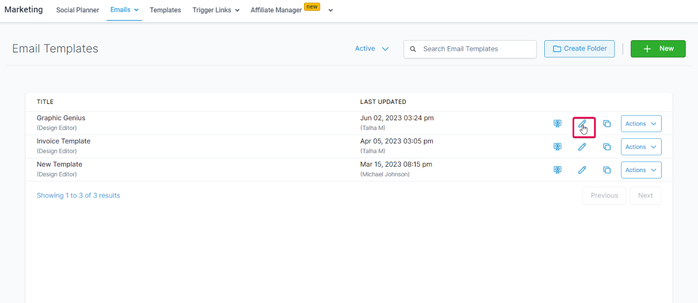
To start, go to the laboratory section of your CRM and activate the Email Builder Inline Editor feature.
Once you have enabled it, proceed to the 'Marketing' section, click 'Emails', and select 'Templates'.
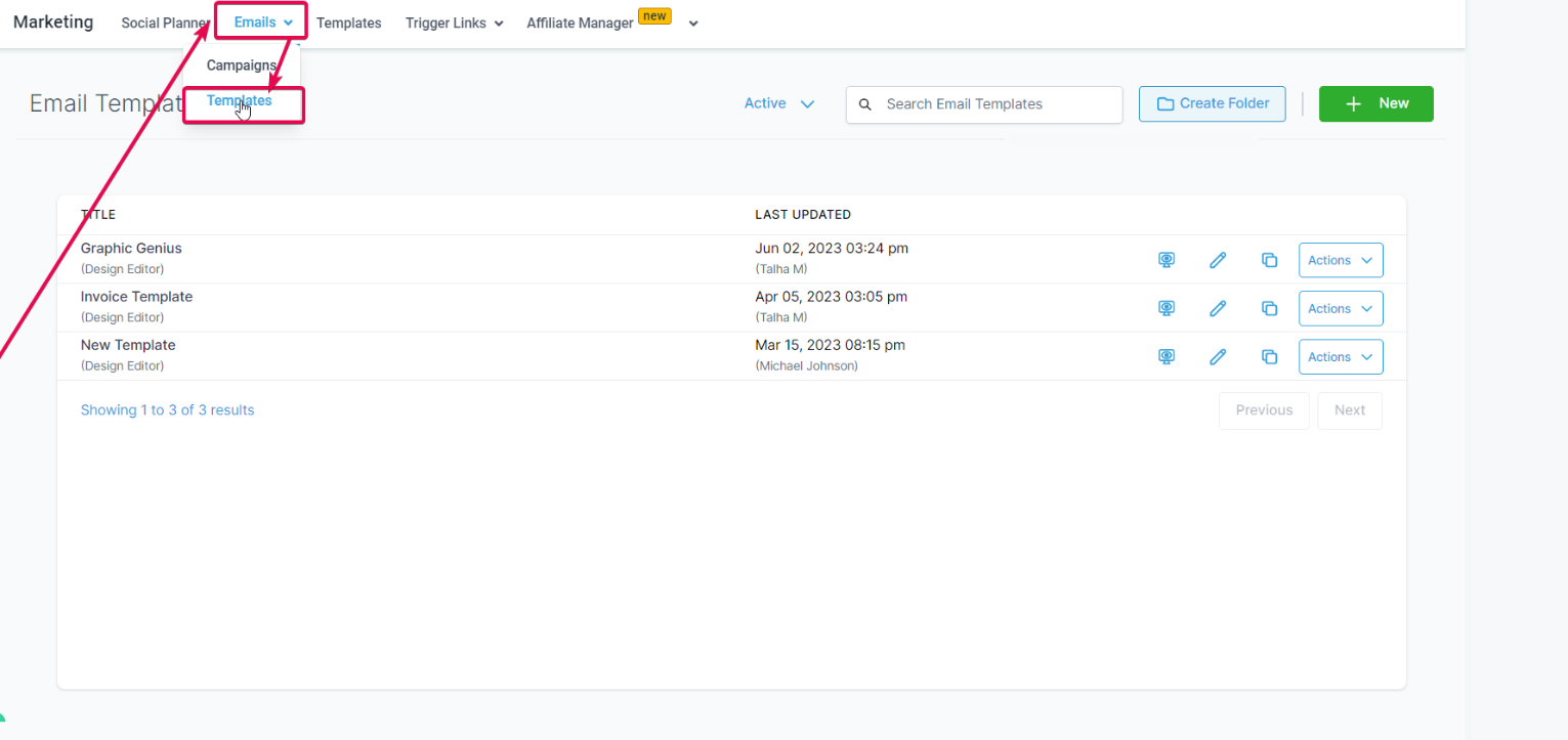
At this point, you have the option to generate a new template.
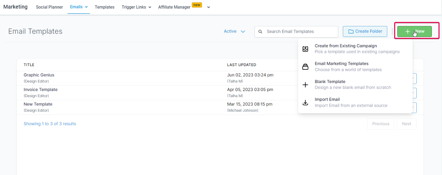
Alternatively, you can modify an existing template.
Navigating the New User Interface
You will encounter a polished and user-friendly interface when you enter the Email Builder. At the top of the screen is a toolbar offering various functions:
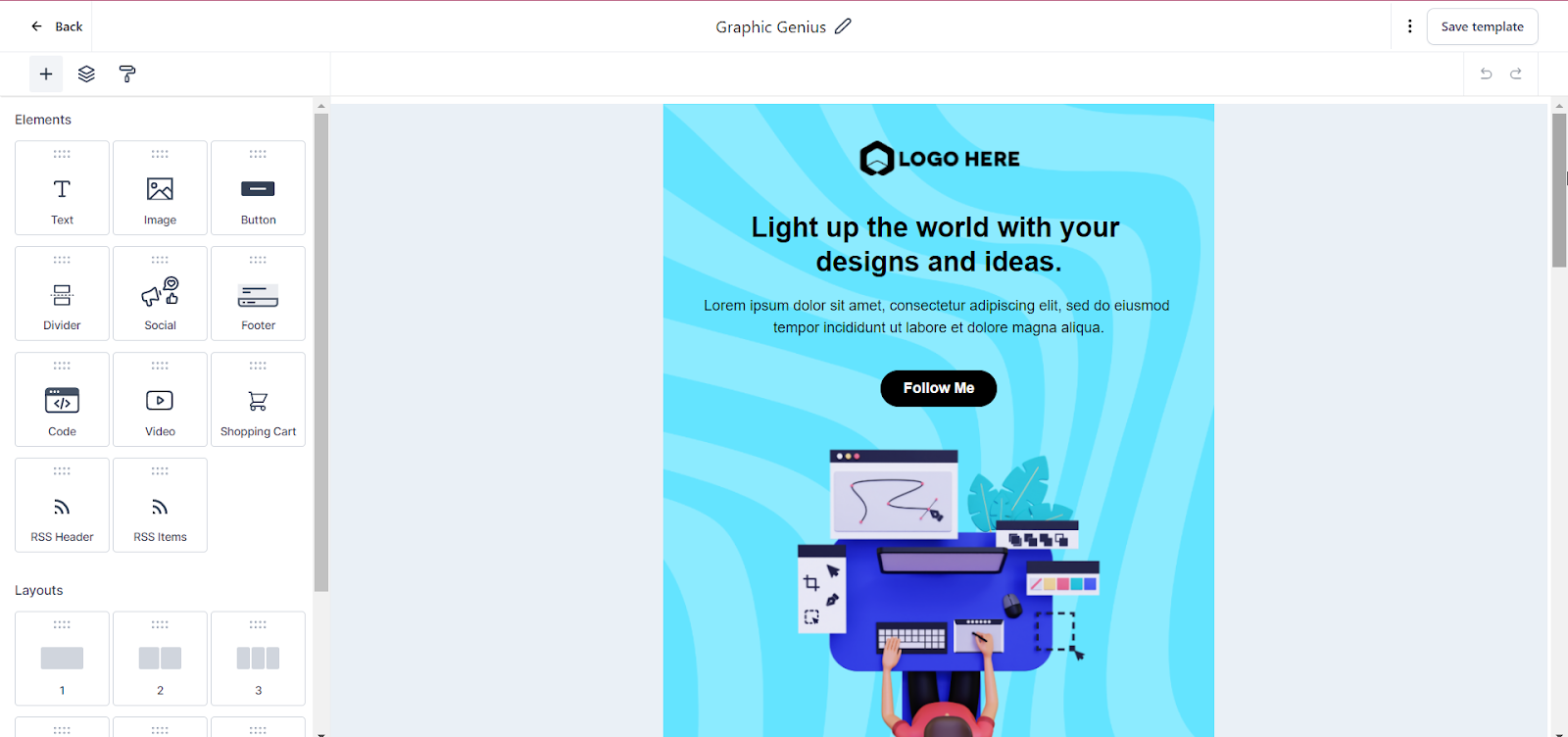
By clicking the 'Add Elements' button, you can incorporate fresh content into your email, ranging from text and images to more intricate components.
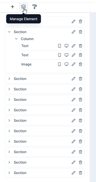
The 'Manage Elements' feature provides a comprehensive view of all the elements within your email, enabling effortless selection and adjustment of each element.
Finally, the 'Appearance' setting empowers you to manage the overall style of your email, encompassing aspects such as background color, dividers, custom CSS styling, and mobile formatting. These functionalities are meticulously crafted to provide you with comprehensive control over the design of your email, spanning from individual elements to the overall aesthetic.
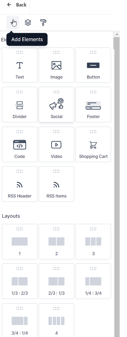
Adding Elements
When you click on the 'Add Elements' button, you will have access to a comprehensive list of content types that you can incorporate into your email. Here is a concise overview of each option:
Text:
This adaptable element serves multiple purposes, such as headings, paragraphs, and captions. Utilizing the inline editor allows you to customize every text aspect, including font style, color, and alignment, ensuring precise control over its appearance.

Image:
The Image element is the ideal tool when incorporating photos, graphics, or any visual content. It allows you to upload images directly from your computer or link them from an external source, seamlessly integrating visuals into your email.

Image Upload: Utilize the upload functionality to directly add an image from your device. The maximum upload size is 10MB, ensuring sufficient capacity for high-resolution photos.
Image URL: Alternatively, you can link an image from an external source or your CRM's Media Library. Simply paste the image URL into the designated field.
Alt Text: Enhance email accessibility by providing a brief and clear description of the image in the Alt Text field. This aids recipients who use screen readers or if the image fails to load.
Link (optional): When clicking the image to redirect to a specific URL, you can input the desired link in the Link field.
Width and Height: Customize the image size by specifying pixel values in the Width and Height fields. Alternatively, choose 'Set height and width to auto' to automatically adjust the size based on the image's original proportions.
Padding: Achieve desired spacing around the image by adjusting the padding. Configure top, bottom, left, and right padding values according to your design preferences.
Alignment: Determine the alignment of your image within its container. Options include 'Center' for center alignment and 'Left' or 'Right' for alternative alignments.
Button: Elevate user engagement by incorporating the Button element. This lets you create clickable buttons linked to webpages, initiate downloads, or activate various click-based actions.
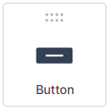

Button Text: Input the desired text you wish to display on your button. For example, you can use phrases like 'Follow Me' to encourage readers to click and visit your social media page.
Font and Size: Select the font and size combination that best complements the aesthetic of your email. For example, you might opt for 'Arial' with a size of '14' for a classic and easily readable appearance.
Font Color: Choose the color for your button text using hexadecimal codes. For instance, '#ffffff' represents white.
Actions:
- URL: The most common button action, where you can direct recipients to a specific webpage by entering the corresponding URL.
- Mail: This action opens the recipient's default email client to compose a new email. You can set a predetermined recipient email address.
- File Download: Choose this action if you want the button to trigger a file download, and provide the direct download URL of the file.
- Telephone: Ideal for mobile users, this action initiates a phone call to the specified number when the recipient clicks the button.
- Other: If you have a unique action in mind not covered by the above categories, select this option.
Alignment: Determine the alignment of your button within its container. Options include 'Left,' 'Center,' or 'Right.'
Total Width: Enable this option if you want your button to span its entire container width.
Background Color: Customize the background color of your button using hexadecimal codes. For example, '#000000' represents black.
Border Radius: Adjust the roundness of your button's corners by setting the border-radius value. Higher values result in more rounded corners. For instance, a radius of '75' gives your button a pill-like shape.
Padding: Control the spacing between your button text and the button's border by adjusting the padding values for the top, bottom, left, and right sides.
By utilizing these settings, you can design buttons that harmonize with the overall appearance of your email, enticing recipients to take action.
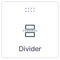
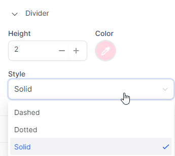
Divider: The Divider element creates clear separations between different sections of your email. Personalize the divider's color, width, and style to align with your design preferences.
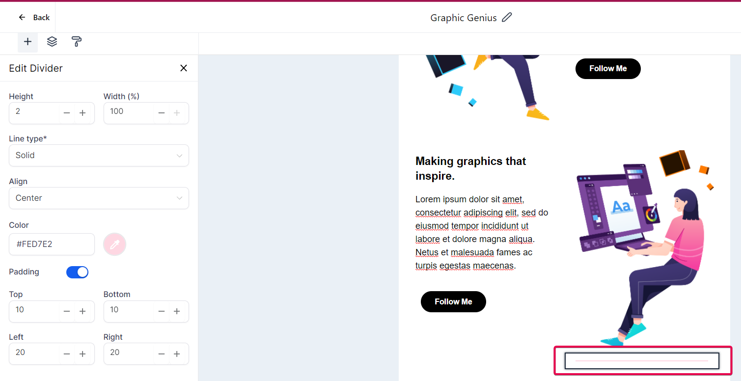
Height: Determine the thickness of your divider line. A higher value will result in a thicker line. For example, setting the height to '2' will create a moderately thick line.
Width (%): Specify the horizontal span of your divider within its container, represented as a percentage of the container width. For instance, a width of '100' means the divider will extend across the entire container.
Line Type: Choose the style of your divider line, such as 'Solid,' 'Dashed,' or 'Dotted.'
Alignment: Select the alignment for your divider, which can be 'Left,' 'Center,' or 'Right.'
Color: Define the color of your divider using a hexadecimal code. For instance, '#FED7E2' could create a soft pink divider.
Padding: Adjust the space between your divider and other elements by setting specific padding values for the top, bottom, left, and right sides of the divider.
Social: If you want your recipients to visit your social media profiles, utilize the Social element. This feature lets you easily include icons linked to various social media platforms.


Social Items: Add your social media platforms, such as Facebook, Instagram, and Twitter. Simply click on the respective platform and enter your handle or profile URL.
Icon Styles: Determine the appearance of your social media icons by selecting different styles, shapes, and designs that align with your email's aesthetic.
Display: Choose the display mode for your icons, whether it's 'Icon,' 'Text,' or 'Icon and Text.'
Align: Adjust the alignment of your icons within the email. Options include 'Left,' 'Center,' or 'Right.'
Font: Set the font for the platform's name alongside the icon. If you opt for the 'Icon and Text' display mode, this font will be applied to the accompanying text.
Font Color: Specify the color of your social icons using a hexadecimal code. For example, '#00a4bd' can represent a teal color.
Size: Modify the size of your icons to ensure they are easily visible without overwhelming the overall design.
Space: Set the spacing between each social media icon to achieve the desired arrangement.
Padding: Adjust the space between your social media icons and other elements within the email. You can customize the padding for the social media icon section's top, bottom, left, and right sides.
By configuring these settings appropriately, you can seamlessly integrate your social media presence into your emails, providing recipients with an effortless way to connect with you on various platforms.
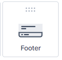
Footer: Utilize the Footer element to incorporate vital information such as contact details, company addresses, or unsubscribe links.
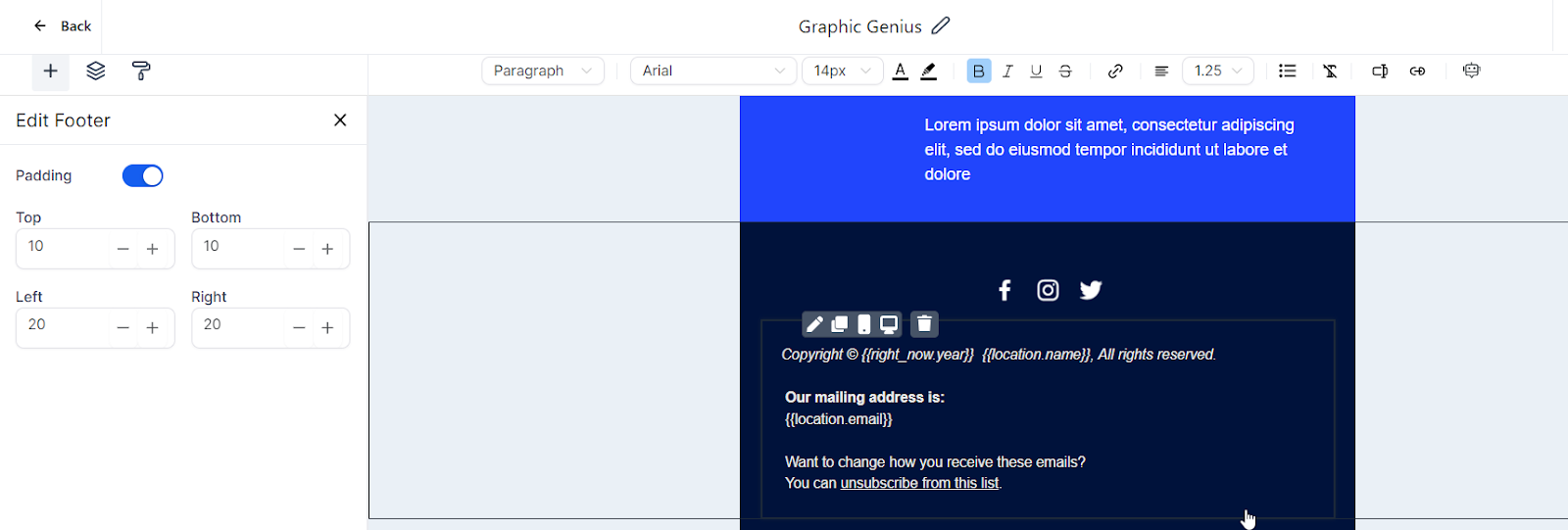
Text Editing: To edit the footer text, simply click on the text to activate the inline editor. From there, you can modify the text to suit your requirements. You can directly type into the footer area if you want to include your company's address, privacy policy links, or an unsubscribe link.
Font and Style: The inline editor provides options to customize the footer text's font, size, and color. Just highlight the text you wish to change and select the desired formatting options from the editing toolbar. You can make the text bold, italicize it, underline it, or add a strikethrough effect.
Links: Adding hyperlinks to your footer is easy with the inline editor. Simply select the text you want to turn into a link, click the 'link' icon in the toolbar, and enter the desired URL. This feature is useful for linking to your company's website or directing recipients to specific pages, such as your terms of service or privacy policy.
Alignment and Spacing: Align your footer text to the left, right, or center according to your design preferences. You can also control the line spacing to ensure your footer text is legible and neatly presented.
Code: If you require more advanced features, the Code element allows you to insert custom HTML code into your email directly. This is where you can input your custom code, enabling you to create more intricate layouts and components within your email.

Please Note:
The Code block is specifically designed for users with proficiency in HTML.
We advise users to have a basic understanding of HTML before utilizing this feature. To ensure proper usage, we recommend familiarizing yourself with the fundamentals of HTML. For guidance, you may find the following resources helpful:
By incorporating custom HTML code, you can craft highly personalized email experiences that surpass the limitations of standard email templates. However, it is important to note that email clients may vary in their support for HTML and CSS. Therefore, it is recommended to thoroughly test your emails across different clients to ensure optimal rendering before sending them out.
Video: Capture the attention of your recipients by incorporating multimedia content. Add a Video element to your email and link it to your hosted video content. This allows you to include engaging videos in your email campaigns seamlessly.

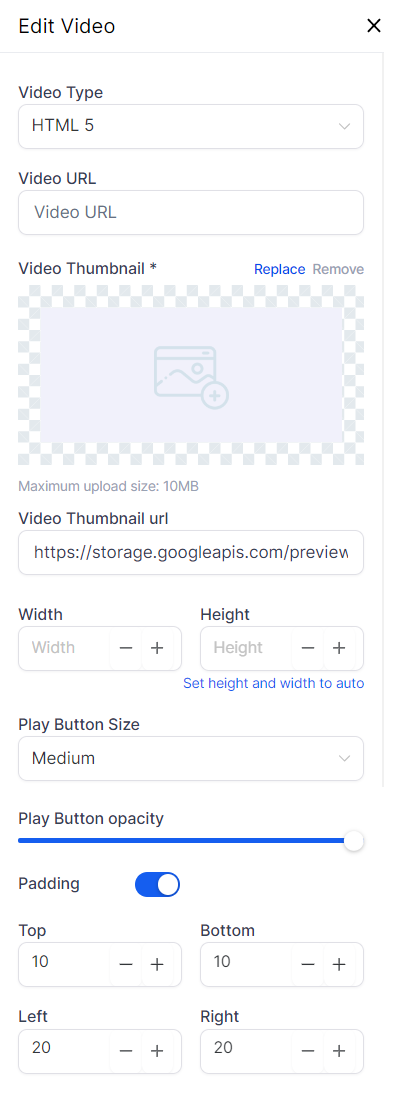
Video Type: Choose the platform where your video is hosted, such as YouTube, Vimeo, Wistia, or HTML 5 video.
Video URL: Paste the direct URL of the video you want to embed from your chosen platform.
Video Thumbnail: Select the image displayed as a preview before the video is played. You can upload a custom thumbnail (maximum size: 10MB) or use an image URL, such as a placeholder image from your Media Library.
Width and Height: Set the dimensions of the video player within your email. Alternatively, you can set the height and width to 'auto,' which adjusts the size based on the video's aspect ratio and available space in the email.
Play Button Size: Determine the size of the play button on the video thumbnail. Options typically include Small, Medium, or Large.
Play Button Opacity: Adjust the transparency level of the play button to achieve the desired visibility in your design.
Padding: Customize the space around the video player by adjusting the top, bottom, left, and right padding values to ensure optimal placement within your email layout.
Shopping Cart: If you operate in the e-commerce industry, the Shopping Cart element is a valuable tool for displaying product details, pricing, and direct links to your online store. It serves as a reminder to potential customers of the products they are interested in and encourages them to complete their purchases.

Here's how to personalize this section:
Padding: Adjust the spacing around your shopping cart content to visually separate it from other sections in the email. You can customize the padding at the cart section's top, bottom, left, and right.
Font: Select the font for the text in your shopping cart, whether the system default or another style matches your email design.
Text Color: Customize the color of the text in your shopping cart, such as black (#000) or any other color that complements your email design.
Background Color: Choose the background color for the shopping cart, which could be white (#ffffff) or any other color that ensures easy readability of the text.
Within the Shopping Cart element, you typically display the following information for each product:
Product Name: The name of the product as it appears on your website or online store.
Price: The individual price of the product.
Quantity: The number of units of the product the customer has chosen.
Line Price: The total price for that line item (Price x Quantity).
Repeat these steps for each product in the shopping cart. Displaying this detailed information provides transparency and helps customers review their orders, ultimately increasing the likelihood of proceeding to checkout.
Customizing your Shopping Cart section enhances the user experience, aligns with your email design, and ultimately drives conversions.
RSS Header: The RSS Header block in the email builder is a powerful tool that lets you dynamically populate the <channel> tags from your RSS Feed in your email campaign. It allows you to leverage your RSS feed content to update and personalize your email campaigns automatically.

Here are the tags and their corresponding custom values you can use:
<title> corresponds to {{rss_feed.title}}
<description> corresponds to {{rss_feed.description}}
<link> corresponds to {{rss_feed.url}}
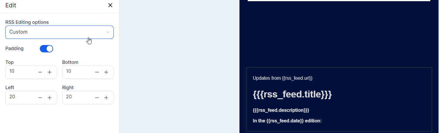
<lastBuildDate> corresponds to {{rss_feed.date}} You can choose between 'Basic' and 'Custom' when using the RSS Header block.
'Basic' will add non-editable text in the Text Editor like this:
<h1 class="h1">{{rss_feed.title}}</h1> {{rss_feed.description}}<br /> <br /> 'Custom' will add editable text in the Text Editor like this:
Updates from {{rss_feed.url}} <h1>{{rss_feed.title}}</h1> <strong>{{rss_feed.description}}</strong><br /> <br /> <strong>In the {{rss_feed.date}} edition:</strong><br />
These RSS <channel> variables can also be utilized in the subject field of your email campaign.
RSS Items: The "RSS Items" element is vital when working with RSS feeds in email marketing platforms. It is a dynamic content placeholder that automatically populates content from the RSS feed into your email campaign. This allows you to include a wide range of content, such as blog posts, news updates, articles, or any other published content accessible through an RSS feed. The RSS Items element helps streamline incorporating dynamic and up-to-date content into your email campaigns.
You have the following RSS Editing Options:
- Excerpts: This option displays a summary or snippet from the original content of each RSS feed item. It provides subscribers with a preview of the content, encouraging them to click through to read the full item on your website.
- Excerpts with Image: Similar to the Excerpts option, this displays a summary or snippet from the original content but also includes an image associated with the RSS feed item. This option adds visual impact and can significantly improve engagement rates.
- Title: Choosing this option displays only the title of each RSS feed item. It takes a minimalistic approach and can be effective when the titles themselves are descriptive or intriguing enough to entice readers to click and read more.
- Full Content: This option imports the entire content of each RSS feed item into your email. It is useful when the feed items are short, or you want to provide complete information within the email. However, be mindful that it may result in longer emails if the feed items are lengthy.
- Custom: The Custom option allows you to choose which information from the RSS feed is included in the email and how it is displayed. You can select attributes such as the title, a short excerpt, the author's name, and a link to the full item. This option requires more setup but offers the most flexibility in tailoring the presentation of the feed items in your email.
When incorporating the "RSS Items" element into your email, you can decide what information to display and how it should be presented.
You can include attributes such as the
title of the post/item ({{rss_item.title}})
the summary or description ({{rss_item.content}})
the URL link to the original post/item ({{rss_item.url}})
the publication date ({{rss_item.date}})
the author ({{rss_item.author}})
You can customize the display of the feed items to suit your preferences.
The customization options also extend to design aspects. For example, you can adjust the padding (top, bottom, left, right) around the element to match your email's aesthetic. Additionally, you can choose to include an image from each post in the email.
Layouts: Layouts determine the structure of your email content. You have various options, from simple single-column layouts to more complex structures.

Here's a detailed explanation of each layout option available:
- Single Column: This layout represents a simple structure where all email content is placed in one straight vertical column. It is commonly used and ensures readability, especially on smaller screens like mobile devices.
- Two Columns: This layout divides your email content into two vertical columns. It is useful for displaying two distinct groups of content side by side, such as an image and a text block, or showcasing two articles from an RSS feed.
1/3:2/3 and 2/3:1/3: These layouts feature two columns of unequal width. In the 1/3:2/3 layout, one column occupies 1/3 of the width, while the other takes up 2/3. The 2/3:1/3 layout reverses the column widths. These layouts effectively emphasize one content more prominently than the other, for example, featuring an image as the main focus alongside an accompanying description.
1/4:3/4 and 3/4:1/4: Similar to the previous layouts, these options allocate one column 1/4 of the width and the other 3/4, or vice versa. This layout is beneficial when one content element is significantly more important than the other, such as a small navigation menu beside a larger content area.
Four Columns: This layout divides your email content into four equal vertical columns. It is suitable for presenting multiple pieces of content of equal importance side by side, like a grid of images, or showcasing multiple articles from an RSS feed.
These layouts offer various ways to structure and present your email content, allowing you to choose the most suitable option based on your specific needs and the type of email you are creating. To add these layout options to your email, drag and drop them onto your canvas. The Inline Editor will appear when you select an element, providing numerous options to customize and modify the selected element according to your requirements.
Managing Text and Formatting:
The inline editor is a convenient and powerful tool that allows you to handle text and its formatting within your email efficiently. By highlighting a specific portion of text, you gain access to various options readily available in the editor.
You can change the heading type.

Select a different font, adjust the font size, and modify the text color.

It doesn't end there - options for bold, italic, underline, and strikethrough are also available.


If you wish to add a hyperlink to your text, the inline editor allows you to do so, giving you control over its display text and target URL.

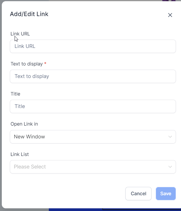
Add/Edit Link: This function enables you to include a new hyperlink in your email or change an existing one.
Link URL: This is the web address (URL) to which the hyperlink will direct the recipient when clicked. It can be a webpage, a downloadable file, or any other online resource. It's important to ensure that the URL is accurate and functional.
Text to Display: This is the visible text in your email and serves as the clickable link. It could be a call-to-action phrase like "Read more," "Download now," or simply the name of the webpage you're linking to. Keeping this text concise and descriptive of the linked content is recommended.
Title: The title attribute is optional and provides additional information about the link. It typically appears as a tooltip when the recipient hovers over the hyperlink. The title can offer extra context or indicate where the link will lead.
Open Link in New Window: When selected, this option causes the link to open in a new browser window or tab instead of the current one. It can be useful when you prefer the recipient to stay on the email or the current webpage while accessing the linked content.
Link List: This dropdown menu may contain a collection of previously used or saved links. It streamlines the process of adding frequently used links, making it faster and more convenient.
You can also adjust text alignment and line height or introduce bullet points to your text.


Here is a description of each bullet point type:
Disc: A filled circle. This is the default style for unordered lists in HTML.
Circle: An empty circle or ring. It is commonly used for secondary or tertiary points in an unordered list.
Square: A filled square. This can serve as an alternative to disc or circle bullets, providing variety or emphasis.
Decimal: Standard numerical (1, 2, 3, etc.) list markers. They are typically used for ordered lists where the sequence matters.
Lower Alpha: Lowercase alphabetical (a, b, c, etc.) list markers. These are often used for sub-points within an ordered list.
Lower Greek: Lowercase Greek alphabetical (alpha, beta, gamma, etc.) list markers. While not commonly used, they can be an interesting alternative to standard markers.
Lower Roman: Lowercase Roman numeral (i, ii, iii, etc.) list markers. They are often utilized in formal or traditional documents, such as legal papers.
Upper Alpha: Uppercase alphabetical (A, B, C, etc.) list markers. These are often used for main points in an ordered list.
Upper Roman: Uppercase Roman numeral (I, II, III, etc.) list markers. Like lowercase Roman numerals, these are frequently employed in formal or traditional documents.
Using Advanced Editing Options
The inline editor provides advanced editing options, including the 'Clear Format' feature. This feature allows you to remove any existing formatting from a selected section of text. It's particularly useful when copying and pasting text from external sources, ensuring clean and consistent formatting within your email.

Custom values: These unique values add a personalized touch to your emails by including specific recipient details such as their name or location. By incorporating personalized elements, you can enhance the relevance of your email to each recipient, leading to improved engagement rates.

Trigger links enable recipients to perform specific actions directly within the email, such as confirming a subscription, unsubscribing, or accessing a special offer. These interactive elements simplify user actions, driving engagement and increasing conversions. By providing convenient options within the email, trigger links make it easier for recipients to take the desired actions, ultimately benefiting your email marketing efforts.

Context: In this section, you can indicate the specific context or topic for the content you want the AI to generate. This helps the AI understand the overall theme and subject matter. It could range from broad topics like "Digital Marketing" to specific ones like "Healthy Recipes." The more precise your context, the more accurate the generated content will be.
Content Title: Here, you provide the main theme or idea for the content you wish to create. This title is a guiding point for the AI to generate the desired content. It could be a blog title, an email subject line, or a product description.
Brief Content Description: In this field, you concisely describe the desired content, including any specific details or angles you want the AI to consider when generating the content.
Keywords: Keywords are specific words or phrases that describe your content. They help guide the AI in naturally incorporating these terms into the generated content. This is particularly useful for SEO purposes.
Writing Tone: This option allows you to define the desired tone of the writing. You can choose from professional, friendly, informal, authoritative, and other tones. The AI will adapt the generated content to match the selected tone.
Number of Variations: Here, you specify how many different versions of the content you want the AI to generate. This allows you to have multiple options to choose from and select the one that best aligns with your requirements. You can create up to five variations.
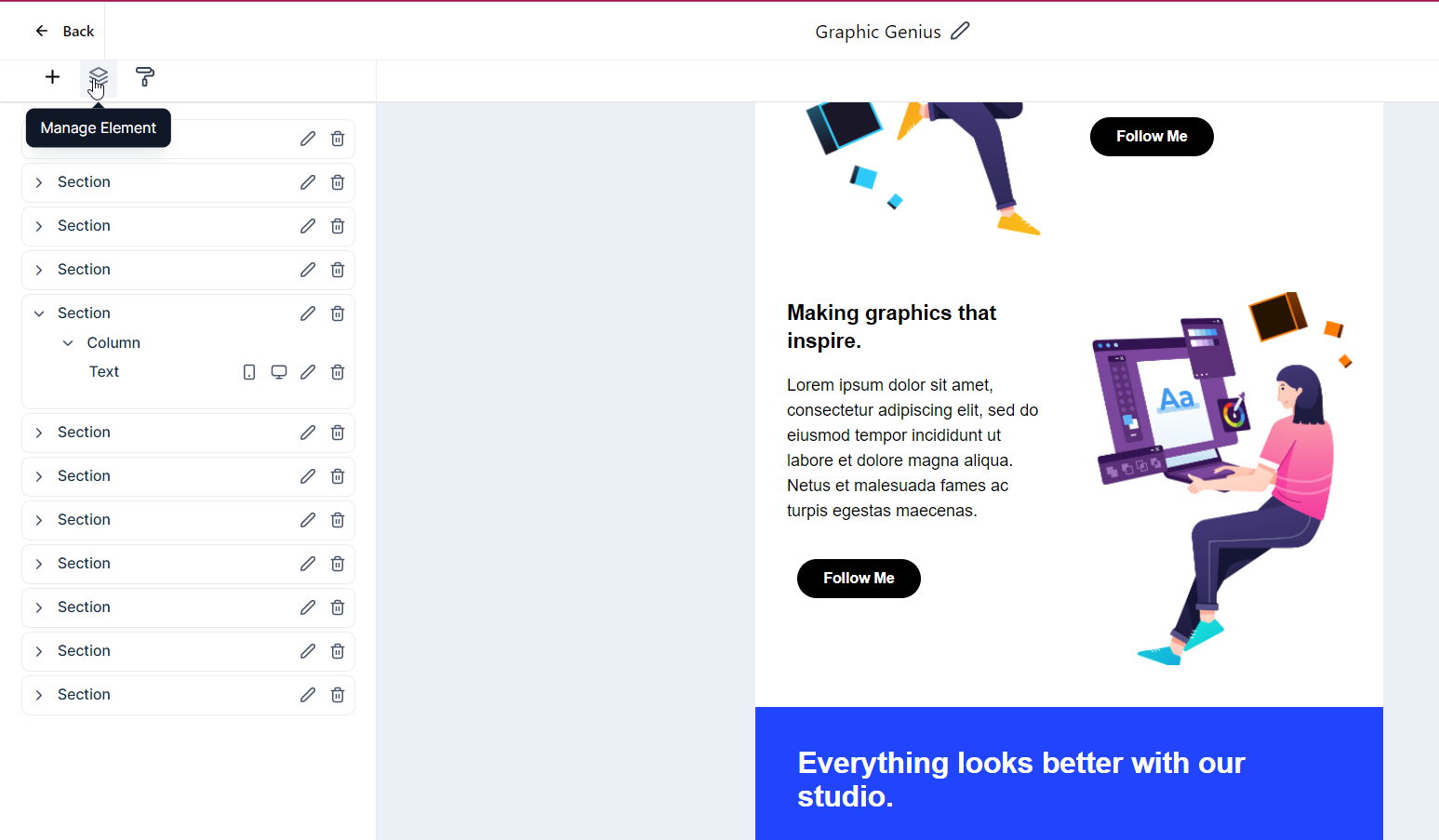
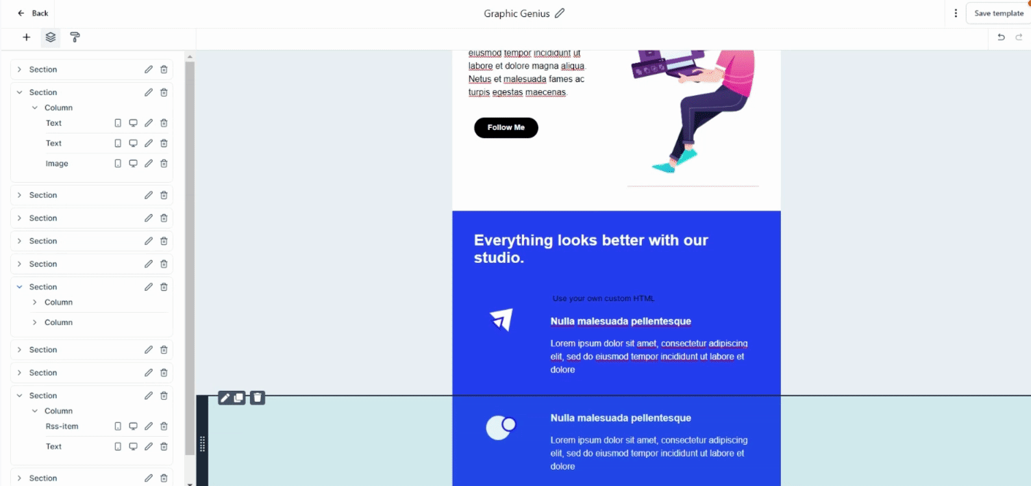
Element Management:
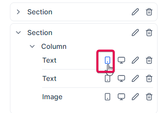
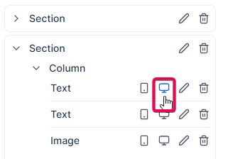
The 'Manage Elements' feature gives you control over each element within your email. Selecting an element in this section allows you to easily modify its visibility for different devices, such as desktop, mobile, or both. This allows you to customize the appearance of your email based on the specific device on which it will be viewed.
Visibility settings provide you with control over the display of elements on different devices. Specifically, the "mobile visibility" and "desktop visibility" options allow you to choose which elements should be shown or hidden when your email or webpage is viewed on a mobile device or desktop computer.
Mobile Visibility focuses on how your content appears on smaller screens, such as smartphones or tablets. It enables you to hide elements that may not display well on mobile devices or to simplify your content for better readability. Additionally, you can adjust the layout or size of elements to ensure a more user-friendly experience on mobile devices.
Desktop Visibility pertains to the appearance of your email or webpage elements on desktop devices. With larger screens and more space, you can include additional elements that may need to fit better on mobile screens. This can involve displaying more extensive content, incorporating elements that require hover actions (which may not apply to mobile devices), or showcasing features better suited for desktop browsing. The Desktop Visibility setting allows you to optimize the user experience for desktop users by taking advantage of the larger screen real estate and capabilities.
Furthermore, each element can be edited individually, allowing you to modify its specific properties.
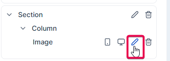
You can remove an element from the' Manage Elements' section if it doesn't align with your email design or content.
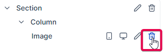
Hovering over and clicking on a section, column, or element in the Manage Elements section will automatically scroll the screen to the corresponding section, column, or element, making locating and editing the desired element easier.
Adjusting Appearance and Styling
The 'Appearance' function is the primary tool for customizing your template's visual aspects and overall style.

Template: In this section, you can customize the color scheme of your template, upload a background image, and adjust the width of your email's content.
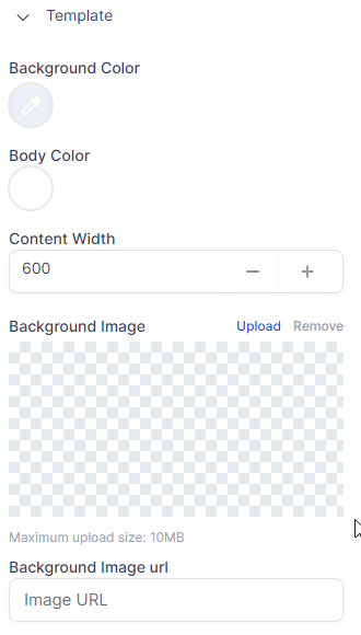
Background Color: This is the color that appears behind all the content in your email. Choose a color that complements your design and enhances readability.
Body Color: This is the main content area of your email where text, images, and other elements are displayed. Ensure that the body color provides sufficient contrast for easy reading.
Content Width: This setting determines the width of the content area within your email. You can adjust it based on your design preferences and the type of content you include. Remember that very wide content may only display well on some devices, especially mobile.
Background Image: You can upload an image that will be used as the background of your email. This can add visual interest and reinforce your brand. Note that not all email clients support background images, so it's recommended to have a fallback color in case the image doesn't load.
Maximum Upload Size: This refers to the largest image file you can upload as your background. Use optimized images to ensure faster loading and compatibility with various email clients.
Background Image URL: Alternatively, you can input the URL of an externally hosted image or an image from your CRM's Media Library. The email will load the image from this URL when it's opened. Make sure the URL is secure (HTTPS) and reliable.
Button: In the appearance settings, you can also design and style interactive email buttons. These buttons serve as call-to-action elements, encouraging recipients to engage with your content.
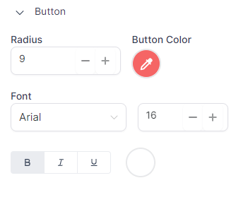
Corner Radius: Adjust the roundness of your button's corners to achieve the desired look. A value of 9 will create moderately rounded edges.
Button Color: Specify the color of your button to align with your brand or the email's theme.
Font: Choose the font type and size for the text on the button. In this case, the font 'Arial' with a size of '16' is selected.
Text Styling: Customize the colors of bold, italic, and underlined text within the button for added emphasis and visual appeal.
Divider: In the appearance settings, the "Divider" section allows you to add customized lines to structure and separate content within the email.
Height: The height setting determines the thickness of the divider line. The default value is 2 pixels, but you can adjust it to match the visual style of your email. A thicker divider will be more prominent, while a thinner one can subtly separate sections.
Color: This setting enables you to select the color of the divider line. Choosing a color that complements the overall color scheme of your email to maintain visual harmony is recommended.
Style: In this option, you can choose the appearance or style of the divider line, such as solid, dashed, or dotted.
Custom CSS: The "Custom CSS" section allows you to apply custom CSS styles to customize the layout of your email further. However, using custom CSS requires a good understanding of CSS and its implications in email design. It's important to note that CSS in emails may behave differently due to variations in email clients and their rendering capabilities.

Here are some recommended resources to help you get started with CSS in email design:
- CSS Tricks: This website offers a wide range of articles and tutorials on CSS, including specific guidance on using CSS in email design. It's a valuable resource for learning and mastering CSS techniques for emails.
- Litmus Blog: Litmus is a popular email testing tool, and their blog contains comprehensive articles on email coding, including CSS best practices. It's a great source of in-depth information and practical tips for email developers.
- Smashing Magazine: "An Introduction To Building And Sending HTML Email For Web Developers" is a comprehensive guide that covers the basics of HTML and CSS in email design. It provides a solid foundation for web developers transitioning into email development.
- MDN Web Docs: "Using CSS" on Mozilla's developer network offers detailed documentation and examples for using CSS, including custom properties, which can be valuable in customizing your email's appearance. It's a reliable resource for understanding CSS concepts and syntax.
- Email Design Workshop: "CSS in Email" is a helpful guide that covers the fundamentals of using CSS in email design. It explains essential techniques and practical examples to improve your understanding of email CSS.
- Can I email…: This resource is similar to "Can I use…" but specifically focuses on email. It provides information on CSS properties and HTML elements supported by major email clients. It's a useful reference to ensure your CSS code is compatible with various email platforms.
By exploring these resources, you'll gain valuable insights and knowledge to enhance your CSS skills in email design.
Mobile Formatting
To ensure your emails look appealing on all devices, including mobile devices, the Email Builder Inline Editor offers a dedicated section for mobile formatting. Within this section, you can customize the visibility of various elements, such as headings, paragraphs, and buttons, specifically for mobile viewing. By tailoring the display of these elements, you can optimize your emails to provide an optimal user experience on both desktop and mobile devices. This mobile formatting feature ensures that your emails are visually appealing and easily accessible to recipients, regardless of their device.
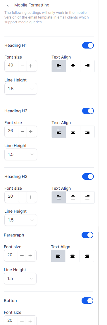
These configurations will specifically impact the mobile version of your email template and will only be effective in email clients that support media queries.
Heading H1:
Font Size: Your primary header on mobile should be large enough to grab attention but not too large to dominate the screen or cause scrolling. Finding the right balance is crucial due to the smaller mobile screen size.
Text Alignment: Center alignment is commonly used for mobile viewing as it provides balance and suits the vertical nature of mobile screens.
Line Height: Adequate line spacing is vital for readability on mobile screens. A line height setting of 1.5 provides a comfortable reading experience.
Heading H2:
Font Size: Secondary headers on mobile screens should be smaller than H1 but still prominent enough to indicate the information hierarchy.
Text Alignment: Center alignment is often suitable for mobile viewing, but the optimal alignment depends on your specific content and design.
Line Height: Like H1, maintaining appropriate line height aids readability on smaller mobile screens.
Heading H3:
Font Size: Tertiary headers should be distinct yet not overpowering. A smaller font size helps differentiate H3 from H1 and H2 while ensuring readability on mobile screens.
Text Alignment: Keeping the alignment consistent with H1 and H2 headers generally contributes to visual coherence.
Line Height: Maintaining appropriate line height ensures content accessibility and readability, even on small screens.
Paragraph:
Font Size: Paragraph text on mobile screens should be comfortable to read, often requiring slightly larger font sizes compared to desktop.
Text Alignment: Paragraphs in mobile view are typically left-justified for languages that read from left to right, but it can vary based on specific content and design needs.
Line Height: Adequate line spacing is crucial for long-form content, making the text less dense and easier to follow on small screens.
Button:
Font Size: Button text should be easy to read and click on a mobile device. A larger font size helps prevent misclicks and improves call-to-action clarity.
Remember, these settings are starting points, and you may need to adjust them based on your content, audience, and overall design to achieve an optimal mobile viewing experience.
Best Practices for Mobile Email Configuration:
When configuring mobile emails, consider the following best practices to enhance usability and effectiveness:
- Use a Single-Column Layout: Opt for a single-column layout as it is easier to scale down for smaller screens, avoiding clutter and confusion.
- Optimize Images: Ensure high-quality images with small file sizes for quick loading. Responsive images automatically adjust to fit different screen sizes. Don't forget to include alt text for accessibility.
- Design Touch-Friendly Buttons: Make your call-to-action buttons large enough to be easily tapped with a finger. A minimum size of 44px by 44px is recommended.
- Limit Text Amount: Keep the text concise by breaking it into small, manageable chunks. Utilize bullet points and subheadings for easy readability.
- Use a Responsive Email Design: Ensure your email automatically adjusts to fit various devices' screens.
- Preview and Test: Always preview and test your emails on different devices and email clients to ensure proper display.
- Include White Space: Use white space to create a clean, readable email layout on smaller screens.
- Font Size and Style: Use font sizes that are large enough to be easily readable on mobile screens. Recommended sizes are 14 for text and 22 for headlines. Avoid using complex or fancy fonts.
- Create Clear and Concise CTAs: Make your call-to-action buttons clear, concise, and easy to locate. The middle of the screen is often a suitable placement.
- Optimize Subject Lines and Preheader Text: Keep subject lines short and engaging, and utilize the preheader text to provide a summary or teaser of your email content. A/B testing different subject line versions can help find the most effective approach.
- Prioritize Plain Text Over Images: To ensure message delivery, use text instead of images, especially since some email clients may not automatically display images.
- Provide an Unsubscribe Option: Make it easy for recipients to opt out of your emails, fulfilling legal requirements and improving user experience.
- Ensure Accessibility: Make your email accessible to everyone by using larger fonts, maintaining good contrast between text and background, and including alt text for images.
Remember, the effectiveness of these best practices may vary depending on your specific audience and content. Continuously test and adapt your approach to achieve the best results for your target audience.
Here are some additional resources that can provide further information and insights on mobile email design best practices:
- Mobile Email Design Further Reading: This article provides in-depth information on mobile design best practices for emails. It covers various aspects of mobile optimization and offers practical tips and examples. Source: https://www.emailonacid.com/blog/article/email-development/mobile-design-best-practices/
- Utilizing Colors in Email Design Further Reading: This resource explores different applications and tools for choosing color schemes, helping you create visually appealing and engaging emails. Source: https://www.creativebloq.com/inspiration/8-free-apps-for-picking-a-colour-scheme
- Optimize Images for Mobile Use Further Reading: Learn techniques and strategies for optimizing email images to ensure fast loading times and a seamless mobile viewing experience. Source: https://www.sendinblue.com/blog/optimize-images-email/
- Tips for CTA Design Further Reading: This guide offers valuable insights and practical tips for designing effective call-to-action buttons in your emails, helping you maximize engagement and conversions. Source: https://unbounce.com/email-marketing/cta-buttons-guide/
- Best Use of Space Further Reading: Discover the best practices for utilizing space in your email designs. This resource provides tips and guidelines for structuring your emails effectively and optimizing the use of space. Source: https://stripo.email/blog/email-layout-optimizer-8-rules-for-structuring-emails/
- Best Use of Scroll Further Reading: Learn about the use of scroll in email design and how to make the most of it. This article explores strategies and considerations for utilizing scroll in your email campaigns. Source: https://www.campaignmonitor.com/blog/email-marketing/2019/07/should-you-use-the-fold-in-email-marketing/
- Is A/B Testing Emails Necessary? Further Reading: This resource discusses the importance of A/B testing in email marketing and provides insights into how to conduct A/B tests to improve your email campaigns. Source: https://sendpulse.com/blog/ab-testing-email-campaign
- Accessibility Guidelines for Emails Further Reading: Learn about email accessibility and how to make your emails inclusive for all recipients. This resource offers guidelines and best practices for ensuring accessibility in your email designs. Source: https://www.emailonacid.com/blog/article/email-marketing/email-accessibility-in-plain-english/
- Mobile-friendly Vs. Responsive Email Design Further Reading: This article explores the differences between mobile-friendly and responsive email design approaches, providing insights to help you choose the right approach for your email campaigns. Source: https://litmus.com/blog/understanding-media-queries-in-html-email
- Mobile Email Configuration Best Practices Further Reading: Gain further insights into mobile email configuration best practices. This resource offers tips and recommendations for creating mobile-friendly emails that deliver an optimal viewing experience. Source: https://www.mailup.com/resources/mailup-blog/email-design-responsive-design-and-mobile-email-marketing/
These resources can provide valuable information and guidance to help you enhance your mobile email design and optimize the effectiveness of your email campaigns.
FAQs
Q: I want to test different email elements to see what works best. How can the email builder help?
A: The email builder includes an A/B testing feature that allows you to test different email components, such as subject lines, content, and CTAs. You can experiment with different variations to see what resonates best with your audience. For more information on A/B testing, refer to the A/B Testing Guide resource.
Q: I own a restaurant and want to inform customers about our new menu items. Which template should I use?
A: The "Restaurant Generic" template offers a variety of layouts suitable for showcasing new dishes and is ideal for promoting your new menu items.
Q: I run a law firm and need to announce new services. Which template will work best for this?
A: To announce new services, you can use the "Legal Minds" or "Justice Law Firm" templates. These templates offer professional designs that are perfect for showcasing your new services.
Q: I manage a charity organization. How can I use the email builder to solicit donations?
A: To create compelling messages about your cause and solicit donations, you can use the "Helping Hand Charity" or "Giving Back Foundation" templates. These templates are designed to engage recipients and highlight the importance of donations.
Q: I have a physical therapy clinic and want to share health tips and exercises with my clients. Which template should I use?
A: The "Physical Therapy" templates are designed to share health tips and exercise information. They provide a suitable layout for delivering helpful content to your clients.
Q: I run an accounting firm and want to send newsletters with tips for financial management. Which template would work best?
A: The "Accurate Accounting Agency" or "Accounting Generic" templates are well-suited for sharing financial tips and advice in newsletters. These templates offer layouts that effectively present financial management content.
Q: I manage a real estate agency. How can I use the email builder to showcase new properties?
A: You can use any "Real Estate" templates to showcase new properties. These templates are designed with layouts ideal for presenting property listings and captivating potential buyers.
Q: I run a beauty salon and want to announce new services and promotions. Which template should I use?
A: The "Radiance Beauty" or "Hair Salon Generic" templates are tailored for beauty-related businesses. These templates provide an attractive design to announce new services and promotions in the beauty industry.
Q: I run a travel agency and want to promote our vacation packages. What would you recommend?
A: The "Pinnacle Travel" and "Getaways Travel" templates are specifically designed to showcase vacation packages. These templates offer layouts that effectively highlight and promote travel offerings.
Q: I run a dental practice and want to send check-up reminders. Which template is best for this?
A: The "Dentist" templates are designed specifically for dental practices and are suitable for sending check-up reminders. These templates offer layouts that cater to the dental industry.
Q: I manage a yoga studio and want to share class schedules and health tips. Which template would you suggest?
A: You can choose any "Yoga Generic" or numbered "Yoga" templates. These templates are specifically designed for sharing class schedules and health tips in the context of yoga studios.
Q: I run an auto repair shop. How can I use the email builder to announce our services and promotions?
A: The "Auto Repair" templates can be used to promote your auto repair services and special promotions effectively. These templates offer layouts that showcase automotive-related content.
Q: I own a gym and want to share fitness tips and class schedules with my clients. What would you recommend?
A: For sharing fitness tips and class schedules, you can consider